How to Increase Conversions: A Guide for SMBs
Posted on
Marketing
Posted at

Improving your website's value proposition drives more conversions than friction reduction alone.
Focusing on quick, structured A/B tests based on user data helps optimize the entire sales funnel effectively.
Conversion rate optimization (CRO) is defined as the practice of increasing the percentage of website visitors who complete a desired action, such as making a purchase, filling out a form, or booking a call. Knowing how to increase conversions is the most cost-effective growth lever available to small and medium-sized businesses. Instead of spending more on ads to get more traffic, CRO extracts more value from the visitors you already have. Value proposition clarity drives three times more conversion impact than friction reduction alone. That single fact should reshape where you focus your time and budget first.
How to increase conversions with a stronger value proposition
Your value proposition is the first thing a visitor reads, and it determines whether they stay or leave. Tier 1 copy elements such as headlines, value propositions, and calls to action can swing conversions by 200% or more. No button color test comes close to that kind of impact.
Writing a strong value proposition means answering three questions in one sentence: what you offer, who it is for, and why it beats the alternative. Vague claims like "high-quality service" do nothing. Specific claims like "same-day delivery for orders placed before 2 PM" give visitors a concrete reason to act.
Focus on benefits, not features. A feature is "256GB storage." A benefit is "store 50,000 photos without deleting a single one." Visitors buy outcomes, not specifications.
Match your headline to the visitor's intent. If your ad promises "affordable gym memberships," your landing page headline should echo that exact language.
Use numbers and specifics. "Save 3 hours per week" outperforms "save time."
Address the primary objection above the fold. If price is the barrier, show your pricing tier or a money-back guarantee immediately.
Keep it short. One headline, one subheadline, one supporting sentence. Clarity beats cleverness every time.
Pro Tip: Run a five-second test with real users. Show them your landing page for five seconds, then ask what the page offers. If they cannot answer clearly, your value proposition needs rewriting.
Use visitor surveys, session recordings, and on-site polls to learn the exact language your customers use. Mirror that language in your copy. This is not guesswork. It is data-driven copy refinement that compounds over every campaign you run.
What are the best ways to reduce friction in checkout and forms?
Friction is anything that makes it harder for a visitor to complete an action. Forms are the single biggest source of friction on most business websites. Reducing form fields from 11 to 4 can increase conversions by up to 120%. That is not a minor tweak. That is a structural change with a measurable payoff.
Offer guest checkout. Forcing account creation before purchase is one of the top reasons for cart abandonment. Remove that wall.
Use multi-step forms with progress indicators. Progressive disclosure builds commitment incrementally. Visitors who complete step one are far more likely to finish step three.
Add inline validation. Show green checkmarks or error messages as users type, not after they submit. This prevents frustration and reduces form abandonment.
Size your buttons for mobile. A tap target smaller than 44x44 pixels fails on most smartphones. Test your forms on actual devices, not just desktop previews.
Remove optional fields from the primary form. Collect extra information in a follow-up email after the conversion is secured.
Pro Tip: Audit every field in your current forms and ask: "Do we actually use this data?" If the answer is no, delete the field. Shorter forms always outperform longer ones when the goal is completion rate.
The marketing funnel perspective matters here too. Friction at the bottom of the funnel destroys the value of every dollar you spent getting visitors there. Fix the leak before you pour in more water.
How does page load speed affect conversion rates?
Page speed is not a technical nicety. It is a direct revenue driver. A 0.1-second speed improvement can increase retail conversions by 8.4% and average order value by 9.2%. Those numbers compound fast across thousands of monthly visitors.

Load times over 3 seconds dramatically increase bounce rates. Visitors leave before your value proposition even loads. All the copy work and social proof you added becomes irrelevant if the page never fully renders.
The most impactful technical fixes fall into four categories:
Optimization | What it does |
|---|---|
Image compression | Reduces file size without visible quality loss |
Script minimization | Removes unused JavaScript and CSS that slow rendering |
Browser caching | Stores static assets locally so repeat visitors load faster |
Content delivery network (CDN) | Serves files from servers closest to the visitor's location |
Mobile speed deserves separate attention. Mobile visitors now represent the majority of web traffic for most SMBs, and mobile connections are slower than desktop broadband. Test your page speed on Google PageSpeed Insights and target a score above 80 on mobile before moving on to other CRO work.
What role does social proof play in increasing conversion rates?
Social proof reduces the perceived risk of buying from you. A small number of product reviews can increase conversions by up to 76.7%, and general social proof elements raise conversions by at least 15%. The mechanism is simple: people trust other people more than they trust brands.
Placement matters as much as presence. Positioning social proof near CTAs and high-commitment form sections builds trust at the exact moment a visitor is deciding whether to act. A testimonial buried in a footer does almost nothing. The same testimonial placed next to a "Buy Now" button does a great deal.
Effective social proof formats for SMBs include:
Verified customer reviews with star ratings and specific outcomes ("Lost 12 pounds in 6 weeks")
Client logos for B2B businesses, showing recognizable brands you have worked with
Case study snippets with a single clear result ("Revenue up 40% in 90 days")
Real-time social signals such as "23 people viewing this right now" or "Sold 47 units today"
For deeper tactics on social proof placement, the research is clear: relevance and specificity beat volume every time. Ten generic five-star reviews are weaker than three detailed reviews that address the exact objection your visitor has.
Pro Tip: Rotate your social proof regularly. A testimonial from three years ago signals stagnation. Fresh, dated reviews signal an active, trusted business.
How should you structure A/B tests for conversion optimization?
Testing without a plan wastes time. 80% of A/B tests fail when they are not driven by quantitative funnel data and qualitative user feedback. Running tests based on gut feel produces noise, not learning.
A structured testing process follows four steps:
Diagnose the funnel. Use analytics to find where visitors drop off. A page with a 70% exit rate is a higher priority than one with a 20% exit rate.
Form a hypothesis. Every test needs a specific prediction: "Changing the headline from X to Y will increase clicks by Z% because visitors currently misunderstand the offer."
Prioritize with a scoring framework. The EPIC framework scores tests by Expected impact, Priority, Implementation cost, and Confidence level. High-score tests run first.
Test one variable at a time. Change the headline or the CTA or the form length. Never change all three simultaneously. You will not know what caused the result.
Test tier | Elements | Typical conversion impact |
|---|---|---|
Tier 1 | Headlines, value propositions, CTAs | Largest swings |
Tier 2 | UX layout, form structure, page flow | Moderate gains |
Tier 3 | Button colors, font sizes, image choices | Smallest gains |
Conversion improvements compound over time. Consistent 5–10% gains at multiple funnel stages produce dramatic long-term revenue growth. The math is on your side if you test systematically and document every result. Review your conversion tactics library after each test cycle and build on what works.
Pro Tip: Keep a shared testing log with the hypothesis, result, and key learning for every test. After six months, patterns emerge that tell you exactly what your audience responds to.
Key Takeaways
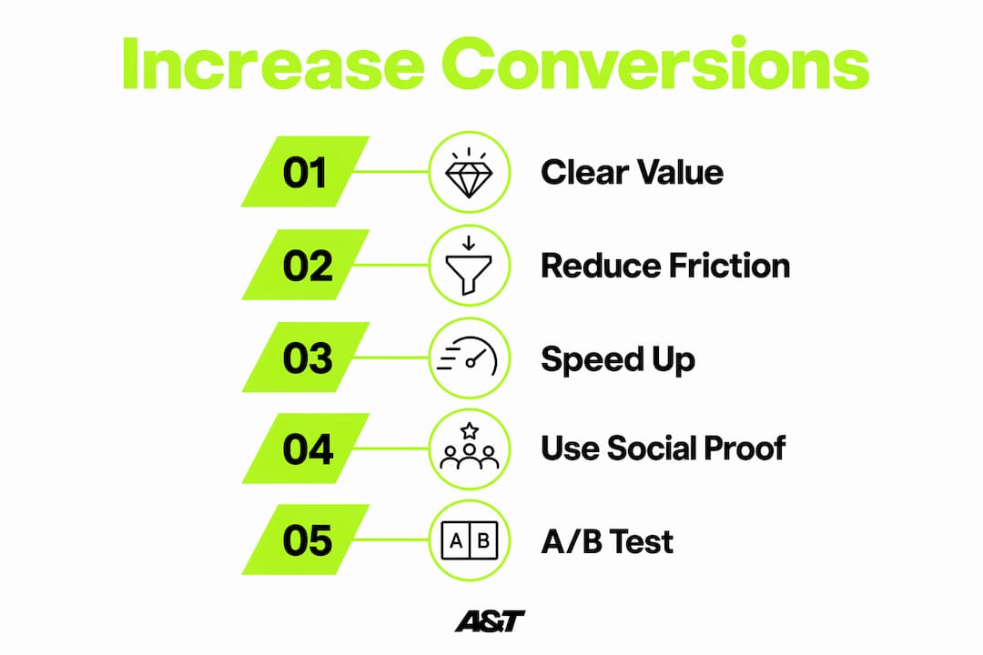
The most effective way to increase conversions is to fix your value proposition first, then reduce friction, speed up your pages, add targeted social proof, and test every change with a structured process.
Point | Details |
|---|---|
Value proposition first | Clear, specific messaging drives three times more conversion impact than friction reduction alone. |
Cut form fields aggressively | Reducing fields from 11 to 4 can lift conversions by up to 120%. |
Speed is a revenue metric | A 0.1-second load time improvement can increase retail conversions by 8.4%. |
Place social proof strategically | Position reviews and testimonials next to CTAs, not in footers or disconnected blocks. |
Test with structure, not instinct | Use the EPIC framework to prioritize tests; 80% of unstructured tests produce no useful insight. |
What Iʼve learned after years of watching conversion tests succeed and fail
The most common mistake I see SMB owners make is jumping straight to A/B testing before their core messaging is clear. They test button colors on a page where the headline does not even explain what the product does. That is like rearranging furniture in a house with a broken foundation.
Start with your value proposition copy. Read it out loud. If you cannot explain your offer in one sentence, your visitors certainly cannot understand it in three seconds. Great messaging fixes more conversion problems than any technical tweak ever will.
Friction reduction is real and important, but it is secondary. A frictionless checkout for a product nobody wants still converts at zero. Get the offer right first, then make it easy to buy.
I also want to push back on the obsession with testing volume. Running 50 tests a year means nothing if none of them are informed by actual user behavior. One well-researched test beats ten random ones. Slow down, read your analytics, talk to your customers, and then test with a clear hypothesis.
Finally, patience matters more than most marketers admit. Optimization is a continuous process that integrates analytics and user insights over time. The businesses that win are the ones that treat CRO as a permanent discipline, not a one-time project.
— Ann
A&T agencyʼs approach to performance driven conversion growth
Conversion optimization does not happen in isolation. The traffic you send to your pages determines who sees your offer, and the quality of that traffic shapes every conversion metric you track. Atdigiagency builds paid ad systems across Google Ads and Meta that are designed from the ground up to attract high-intent visitors and match them to the right landing page message. The team combines data-driven campaign execution with creative development to make sure your ad spend works harder at every stage of the funnel. If you want campaigns that generate real revenue, not just clicks, Atdigiagency delivers the kind of retargeting and funnel work that turns browsers into buyers.
FAQ
What is conversion rate optimization?
Conversion rate optimization (CRO) is the process of increasing the percentage of website visitors who complete a desired action, such as a purchase or form submission. It uses data analysis and structured testing to improve results without increasing ad spend.
How much can reducing form fields improve conversions?
Reducing form fields from 11 to 4 can increase conversions by up to 120%. Shorter forms lower the effort required to complete an action, which directly reduces drop-off rates.
Why does page speed matter for conversion rates?
A 0.1-second improvement in load time can increase retail conversions by 8.4%. Visitors who wait more than 3 seconds for a page to load are significantly more likely to leave before seeing your offer.
Where should I place social proof on my website?
Place social proof directly adjacent to your CTAs and payment fields, where perceived buyer risk is highest. Reviews and testimonials in those positions build trust at the exact moment a visitor is deciding whether to act.
How do I prioritize which conversion tests to run first?
Use a scoring framework like EPIC to rank tests by expected impact, priority, implementation cost, and confidence level. Always start with Tier 1 elements: headlines, value propositions, and CTAs, since these produce the largest conversion swings.


